Introduction
Social media has become an invaluable tool for interior designers, architects, and visualizers to display their work to a wide audience. However, the types of images that thrive on these platforms require an entirely different approach compared to portfolio website visuals or client presentations.
When creating interior renderings specifically for social media, it’s essential to optimize them not just for visual impact, but for seamless technical display across various networks.
In this in-depth guide, we’ll cover the key strategies for custom-tailoring your interior renderings to look their absolute best on popular social sites.
The Importance of Image Dimensions
The foundation of any social media visual asset is using the proper image dimensions. Each major platform has its own strict requirements for image sizes in feeds, headers, profiles, and more.
If interior renderings aren’t sized specifically for the intended social platform, they won’t display correctly. At best, the wrong dimensions mean awkward cropping. At worst, it can result in distorted, pixelated images that leave a bad impression.
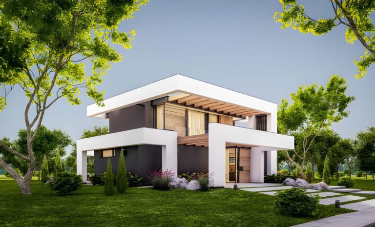
Whether you’re rendering a gorgeous living room, kitchen, bedroom, or any interior space, taking the time to render images at exactly the right proportions for each social network is a must.
Image Specifications for Facebook

For standard news feed posts, Facebook’s recommended image size is 1200 x 630 pixels, with an aspect ratio of 1.91:1. This ensures the image will display properly across desktop and mobile.
However, it’s important to note that Facebook also has a safe frame overlay on news feed images that is 1000 x 1000 pixels square. Any text or important visual elements you want to have maximum impact and clarity should be designed to fit within this safe zone.
For Facebook’s cover images, the dimensions are quite different – 820 pixels wide by 312 pixels tall, with a more panoramic 2.63:1 ratio. This banner-like size works perfectly for timelines on business pages or profiles.
Twitter's Vertical-Friendly Image Requirements
Compared to Facebook’s horizontal layout, Twitter’s vertical feed lends itself to taller, more portrait-oriented images. The standard in-feed image size for Twitter is 440 pixels wide by 220 pixels tall.
This size may seem quite small, but it’s optimized for Twitter’s narrow column layout. When designing Twitter images for your interior visuals, keep them minimalist and focus on drawing the eye upward for ideal results.
For Twitter header photos, a size of 1500 x 500 pixels is recommended. This long and lean banner space is perfect for extended landscapes.
One additional point to note – Twitter crops images differently for desktop vs. mobile platforms. Test your images in both places to ensure your focal point remains centered.
Instagram's Square Grid and Mobile Dimensions
As a predominately mobile-first platform, Instagram’s feed is built around square 1:1 ratio images. For most posts, 1080 x 1080 pixels is the ideal size to design for. This allows for crisp clarity on high-resolution smartphones and tablets.
However, you can also upload rectangular images at a 4:5 vertical to horizontal ratio. The most common dimensions for this style are 1080 pixels wide by 1350 pixels tall. This size works well for portraits or artistically framed shots.
For Instagram Stories, a taller 9:16 aspect ratio is better. The standard size is 1080 x 1920 pixels. This vertical style is perfect for sharing in-progress renders or behind-the-scenes shots.
LinkedIn Profiles Call for Square Images

On LinkedIn, square profile pictures tend to stand out more in the feed. The recommended size for your headshot or brand image is 400 x 400 pixels. This relatively smaller size ensures fast loading, even on slower connections.
For other images shared in posts or ads, go with the standard 1200 x 627 pixel size at a 1.91:1 ratio. This is large enough to convey details clearly.
YouTube Thumbnails & Channel Artwork Guidelines
YouTube may not seem like a typical outlet for interior rendering visuals. However, it can be a great platform for time-lapse creation videos or tutorials.
For YouTube video thumbnails, the standard size is 1280 x 720 pixels, with a widescreen 16:9 aspect ratio. For channel branding images, 2560 x 1440 pixels is recommended. Follow YouTube’s detailed cover art dimensions to avoid any cropping.
By taking the time to understand the preferred image specifications on each social network, you can confidently design interior renderings optimized for flawless technical performance. But dimensions are just the starting point…
Composing Shots to Captivate Audiences
Beyond just measurements, the actual composition of interior rendering scenes requires an artistic eye if you want to captivate social media audiences.
The principles of classic photographic composition provide fantastic guidelines when framing your 3D interior visualizations:
1. Use the Rule of Thirds for Natural Balance

Imagine a 3×3 grid laid over your interior image. The rule of thirds suggests that placing important elements on the grid lines or intersections creates balance and interest.
Applying the rule of thirds when framing shots avoids awkward centering. Play with offsetting focal points for organic results.
2. Identify One Strong Focal Point
In wide exterior or lifestyle photos, multiple subjects may work. But for interiors, identify a single bold focal point, like an accent furniture piece or decorative lighting.
Simplify the scene around that eye-catching subject to amplify its prominence. Don’t distract viewers from your hero.
3. Embrace Negative Space
Interior shots don’t need to be crammed from edge to edge. Allow breathing room around your focal point to let it stand out.
Don’t overload the composition. Use strategic negative space to create visual allure and draw viewers deeper into the scene.
4. Play With Unique Perspectives

Straight-on angles feel sterile. Instead, shift the camera vertically for overhead bird’s eye views, or get down low for worm’s eye depth.
Perspective heightens the drama. Lead lines also help move the gaze through the interior space.
5. Maintain Brand Style Consistency
While some variety adds interest, social feeds should feel cohesive. Maintain a consistent mood, color scheme, and style across your images.
Repetition helps reinforce branding and gives viewers a sense of familiarity.
By honing compositional skills specifically for interior renderings, you can create truly stellar social media imagery.
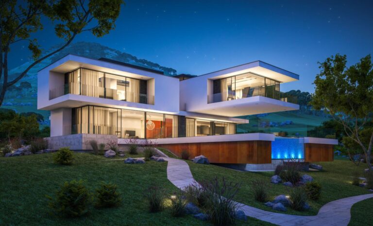
Lighting Tips for Atmospheric Interior Renderings
Without proper lighting techniques, even the most stunning interior 3D visualizations will fall flat. Lighting can make or break a rendered scene.
Some lighting tips help set the perfect mood:
1. Use Abundant, Diffused Key Lighting
The biggest rookie mistake is using a single harsh light source. This results in dark shadows and contrast. Instead, create soft, glowing lighting across the entire scene.
Position larger polygon area lights near windows, or use mesh emitters overhead to mimic bright, diffused skylights. This fills all the shadowy areas naturally.
2. Match Real-World Light Direction

Study reference photos to see how light enters real-world interiors. Light generally streams downward from above, supplemented by side windows. Replicate these angles in renders.
If the lighting doesn’t follow the laws of physics, the scene won’t feel believable. Matching real-world conditions improves authenticity.
3. Use Pools of Light to Draw Attention
While diffused lighting should fill a scene, also accentuate key areas, like architectural features, textural materials, or decorative accents.
Spotlights, side lighting, backlighting, lens flares, and other dramatic effects help tell a visual story and highlight design elements. Use them judiciously.
4. Embrace Light Vignettes
Vignettes are images framed with varied light against dark backgrounds. When used effectively, this intensely amplifies focus on your main subject.
Many iconic portraits employ vignettes – this technique also works beautifully for interior renderings.
5. Ensure Realistic Material Light Interactions

One key lighting tip is to preview materials in render mode. Glass, metal, water should refract light appropriately. Pay close attention to how lighting affects different textures.
Mimicking the real physics of light transforming materials makes a scene exponentially more believable. Study material luminance values.
Lighting can transform a basic interior rendering into an evocative, professional-grade visual.
Choosing Between Photorealism vs. Artistic Stylization
Interior renderings generally fall into two camps – photorealistic visuals that emulate real-world photographs, and artistically stylized graphics with exaggerated colors, textures, lighting, and abstract style.
So which style works best for your social media presence? Here are some key pros and cons to weigh for each approach:
Benefits of Photorealistic Renderings
- Viewers find it easier to visualize the real physical spaces
- Demonstrates technical skill at recreating reality
- Looks professional for client presentations
- Photos blend seamlessly into brand feeds
Downsides of Photorealism

- Can sometimes look too sterile and cold
- Difficult to achieve believable results
- Requires more computing power and render time
Advantages of Stylized Renderings
- More creative freedom to develop a signature visual style
- Fosters distinctive branding beyond limitations of photos
- Can enhance mood, emotion, and atmosphere
Drawbacks of Stylization
- Materials and textures aren’t accurately represented
- Can sometimes look less professional depending on style
In general, a hybrid approach delivers the most flexibility. Use photorealism for client presentations to showcase finished designs accurately. Then develop a complementary stylized aesthetic for your social brand presence.
This allows you to convey technical skill while also being more playful withevocative lighting, colors, and compositions. The same interior can become wildly different visual stories.
Post-Processing Images Before Uploading
After rendering images, proper post-processing can transform results from decent to stunning. Never upload finished interior visualizations without at least basic image editing and polishing.
Some post-processing techniques that dramatically enhance rendered interiors include:
1. Color Grading for Visual Cohesion
Use color lookup tables, grading tools, and filters like teal and orange to unify images with consistent mood, contrast, and style. Create thematic editing presets.
2. Boost Smart Object Contrast
Social media compression dulls contrast. Enhance black and white points in Levels or Curves to maximize dynamic range.
3. Make Colors Pop Through Selective Saturation
Vibrant colors attract more attention, but avoid oversaturation. Use masking to leave some areas more muted.
4. Crop Away Visual Clutter

Crop out any distracting elements or messiness around the edges. Reframe inappropriate social media aspect ratios.
5. Add Sharpness Through Detail Enhancement
Increase clarity and make fine details pop by applying intelligent sharpening only to key areas, avoiding noise.
6. Prevent Banding Artifacts in Gradients
Banding makes gradients look choppy. Add noise or dithering effects to disguise it. Save images properly to prevent compression issues.
With the right polish, your interior renderings will make a phenomenal first impression on social feeds.
Conclusion
Optimizing interior design images for social media requires an entirely unique approach compared to portfolio sites or in-person presentations. By taking into account proper image sizing, intelligent composition, evocative lighting, compelling style, and post-processing refinements, you can craft interior renderings tailored for maximum visual impact across the social web.
Frequently Asked Questions
Understanding image sizes is important because each platform has different specifications. Images won't display properly if the wrong dimensions are used. This can lead to awkward cropping, distortion, and pixelation. Optimally sized images look crisp and enhance engagement.
Good composition principles create balanced, appealing shots that draw viewer attention exactly where intended through focal points, negative space, and angles. Poor composition is confusing and misses opportunities to maximize visual storytelling.
Lighting is crucial for setting mood and conveying spatial atmosphere. Bad lighting looks flat and unrealistic. Thoughtful lighting techniques emphasize important features and materials naturally for believable, professional results.
Different styles like photorealism and stylization complement one another. Photorealism conveys technical ability while stylization boosts creative branding. Using both diversifies content.
Color grading and post processing unify visual style through corrections like contrast, saturation, cropping, and sharpening. This takes images from good to great.
Wrong dimensions lead to awkward cropping, distortion, blurriness, and pixelation. Sizing images improperly damages visual quality and brand reputation.
Testing ensures images render properly across different devices. Layouts and image cropping vary on desktop vs. mobile. Evaluating display differences keeps content optimized.
Maximizing engagement requires drawing viewer attention clearly to hero areas through composition, lighting, style, and post processing polish. Every element should enhance visual storytelling.